Educators agree that equity in education should be a priority, that all students should have the opportunity to learn on an even playing ground.
The problem is knowing where to start and how to help…
How can educators support students in need when they are facing challenges both inside and outside the school system where educators have limited influence?
Moreover, which student populations are being underserved?
Complicating matters even further? Every school system is different. Demographics aren’t distributed evenly across the USA, or even across individual states.
Often, they’re not even evenly distributed across districts.
There is no one-size-fits-all approach for schools to follow when it comes to helping underserved populations.
So, districts need to look at their own specific circumstances to uncover which underserved student groups are at their schools…
For example, an inner-city school serving a diverse group of students is going to face much different challenges than a rural school serving students from low socio-economic backgrounds.
And a suburban school with large migrant populations will face different challenges than one serving students with Native American backgrounds.
The point is, regardless of where your school is located, or the demographics of the students you serve, there is always room for improvement, and there is almost always an underserved student group to be uncovered.
Just think about all the variables and challenges that can exist for students…
- Age (older or younger for their grade?)
- Ability (physical and mental)
- Ethnicity (heritage)
- Gender
- Race (physical)
- Sexual Orientation
- Socio-Economic Status
- Family Makeup
- Behavior
- Educational Background
- Geographic Regional Background
- Language
- Learning Style
- Beliefs (political, social, religious)
With all these variables in existence, you’ll need to do some legwork and research to discover which student populations at your school are most underserved.
This will help your district to:
- Pinpoint underserved student groups
- Inform program planning and measure efficacy
- Illustrate where resources are needed most
- Visualize important trends in behavior and achievement
- Advocate for specific policy changes
- Provide evidence for funding opportunities
Below we’ve outlined a process to help you pinpoint underserved student groups using your district’s student data.
Here are 5 Steps to Uncovering the Inequities that Exist in Your District, School, & Classroom
Step 1: Get the Big Picture
You may think the underserved students at your school are obvious, but it’s still good to do this exercise to get base metrics of the demographic makeup of your school. You might even reveal some data that surprises you.
To start, break down your school’s data by major demographic groups. You can pick whatever variables you think are most important or easiest to gather, but for most schools the following metrics are a good place to start:
- Gender
- Race
- Residency/Zipcode
- Ethnicity/Religion
- Socioeconomic (i.e. Participation in Free/Reduced Lunch Program)
- Primary Language
- Disability
- Migration Status
Here is a very basic example of data you might gather:
|
Gender |
|
|
Male |
52% |
|
Female |
48% |
|
Race |
|
|
White |
42% |
|
Black or African American |
26% |
|
Hispanic/Latino |
17% |
|
Asian |
10% |
|
Two or More Races |
5% |
|
Socioeconomic |
|
|
National School Lunch Program |
22% |
|
NA |
78% |
Next, you’ll want to get a snapshot view of the student performance indicators you choose to measure.
At a minimum, we recommend districts track data proven by research to correlate with student graduation:
- Attendance
- Behavior
- Core Academics
Sample District Performance Data:
|
School-wide Attendance % |
95% |
|
Average Behavior Incidents per Student |
2 |
|
Core Academics |
84% |
|
English/Language Arts |
86% |
|
Math |
84% |
|
Science |
84% |
|
Social Studies |
85% |
Now that you have some base data to refer to, it’s time to dig deeper…
Step 2: Disaggregate Your Data by Subpopulations
Disaggregating data is the practice of breaking down aggregate data (like the data collected in step one) into smaller subpopulations to discover hidden insights about student groups.
In the above step you identified the subpopulations that exist in your school by getting the big picture of your student population.
The subpopulations you choose to isolate will vary based on the demographic makeup of your school. That’s why step one is so important…
Perhaps you found that your district has a group of migrant students who are also English Language Learners, or a percentage of students who qualify for free or reduced school lunches.
Now, isolate these subpopulations and determine how they are doing regarding the student performance metrics.
How you do this will depend on what data tool you have.
If your district has access to Learning Circle, you can simply use our filtering tool to compare student populations by any variable tracked at your school.
This includes variables such as gender, race, 504 and IEP plans, grade level, Limited English Proficiency (LEP), whether a student is new to the district, and more.
Otherwise accessing this data and getting it into a workable format will likely be the most challenging part of the process. If you’re working with Excel you can use formulas, filters or create a pivot table to help.
In the end, you want to have a table that measures the student performance indicators for each subpopulation you’re measuring:
|
Male |
Female |
White |
Migrant |
African American |
|
|
Attendance % |
94% |
96% |
97% |
92% |
95% |
|
Behavior Incidents |
3 |
1 |
1 |
1 |
3 |
|
Core Academics |
84% |
85% |
88% |
77% |
86% |
|
English |
82% |
89% |
92% |
75% |
88% |
|
Math |
88% |
80% |
87% |
76% |
86% |
|
Science |
85% |
82% |
84% |
79% |
85% |
|
Social Studies |
82% |
88% |
88% |
77% |
86% |
Step 3: Compare Disaggregated Data to Overall Population
In the simplified example below, we’ve isolated some student populations and compared them to the overall population average. Not only that, but we can also use this table to compare between the different subpopulations.
|
Average |
Male |
Female |
White |
Migrant |
African American |
|
|
Attendance % |
95% |
94% |
96% |
97% |
92% |
95% |
|
Behavior Incidents |
2 |
3 |
1 |
1 |
1 |
3 |
|
Core Academics |
84% |
84% |
85% |
88% |
77% |
86% |
|
English |
86% |
82% |
89% |
92% |
75% |
88% |
|
Math |
84% |
88% |
80% |
87% |
76% |
86% |
|
Science |
84% |
85% |
82% |
84% |
79% |
85% |
|
Social Studies |
85% |
82% |
88% |
88% |
77% |
86% |
One fast and easy way to find positive/negative trends is to subtract the subpopulation data point from the average data point by creating a variance/different table.
|
Average |
Male |
Female |
White |
Migrant |
African American |
|
|
Attendance % |
95% |
-1% |
1% |
2% |
-3% |
0% |
|
Behavior Incidents |
2 |
1 |
-1 |
-1 |
-1 |
1 |
|
Core Academics |
84% |
0% |
0% |
3% |
-8% |
2% |
|
English |
86% |
-4% |
4% |
7% |
-11% |
3% |
|
Math |
84% |
4% |
-4% |
3% |
-8% |
2% |
|
Science |
84% |
2% |
-2% |
1% |
-4% |
2% |
|
Social Studies |
85% |
-3% |
3% |
3% |
-8% |
1% |
You can also create variance tables to compare subpopulations – this can really demonstrate achievement gap.
Male vs Female Example
|
Male |
Female |
Variance (F-M) |
|
|
Attendance % |
94% |
96% |
2% |
|
Behavior Incidents |
3 |
1 |
-2 |
|
Core Academics |
84% |
85% |
1% |
|
English |
82% |
89% |
7% |
|
Math |
88% |
80% |
-8% |
|
Science |
85% |
82% |
-3% |
|
Social Studies |
82% |
88% |
6% |
White vs African American Example
|
White |
African American |
Variance (AA – W) |
|
|
Attendance % |
97% |
95% |
-2% |
|
Behavior Incidents |
1 |
3 |
+2 |
|
Core Academics |
88% |
86% |
-2% |
|
English |
92% |
88% |
-4% |
|
Math |
87% |
86% |
-1% |
|
Science |
84% |
85% |
1% |
|
Social Studies |
88% |
86% |
-2% |
White vs Migrant Example
|
White |
Migrant |
Variance (Migrant – W) |
|
|
Attendance % |
97% |
92% |
-5% |
|
Behavior Incidents |
1 |
1 |
0 |
|
Core Academics |
88% |
77% |
-11% |
|
English |
92% |
75% |
-17% |
|
Math |
87% |
76% |
-11% |
|
Science |
84% |
79% |
-5% |
|
Social Studies |
88% |
77% |
-11% |
Using these variance tables produced some interesting findings from our example district:
- Migrant students are struggling in all core academics and in attendance
- African American students have lower attendance, lower English scores, and more behavior incidents
- Male students on average misbehave and miss more school than females
- Females are doing significantly worse in math than their male counterparts
- Males are doing significantly worse in English and social studies than their female counterparts
- Females attend school more often than males on average
Step 4: Compare Schools and Grade Levels
Now, that you’ve compared disaggregated data at the district level, it’s time to look at individual schools and grade levels in your district.
Many school districts have school with widely varying demographics. Is there an outlier school that needs extra resources?
And, there are certain ages or grade levels where student performance data can change significantly.
For example, data shows that female students typically do as well or better than their male counterparts in math, but around junior high this data tends to flip.
By getting granular with student data, we can move beyond the “what” factors of inequity
and determine “why” inequity exists and “how” to fix it.
Step 5: Implement Programs, Refine, Measure, Repeat
Steps 1-4 help you to uncover general trends. From here you can diagnose and treat the areas where students need extra resources to receive an equitable education.
Some quick examples:
- Math club for girls in the 7th grade when you realized they started to fall behind their male peers at this age.
- Alarm clock program for students struggling with attendance
- Free English tutoring and pen pal club for English Language Learners
- Free breakfast for students to ensure students on free & reduced lunch programs aren’t left feeling hungry in morning classes
- Study skill classes for underperforming students
- Self-management class targeted at male students
- Policy change for teachers and principals for alternative discipline options to suspension or office visits
As time goes on, you can start to measure these trends and see if the extra resources, programs and interventions you’ve invested into your underserved populations are making a difference.
Monitor these interventions continuously to see if they’re having an impact.
Is the impact positive, negative, or even neutral? This is knowledge is vital to making informed decisions on whether to remove or add new interventions for students.
Continue to repeat steps 1-4 to uncover other inequities that exist to find other underserved groups. There is always more that can be done. And more ways to test for inequities.
Here are additional examples of data comparisons you can make:
- Are underserved students typically assigned to more or less experienced teachers? Is this correlating to their success?
- Look for outlier students who are doing better than their peers in underserved groups. What is different about their circumstances that might be helping them succeed?
- Are students who don’t participate in programs with out-of-school time providers doing better or worse?
- Are underserved student groups more or less involved in extra-curricular activities?
You can also start to create new data:
- Surveys and questionnaires (for students, teachers, and community members)
- Interviews or focus groups
- Teacher logs
- Classroom observations
Bonus Tip #1: If You Have an Early Warning Indicator System, Analyze At-Risk Students
One component of Learning Circle is its early warning system. Using a system like Learning Circle, you can analyze students who are in alarm and/or warning stages and see if there are any demographic trends.
Using filters, schools can isolate certain student populations to see their risk factors.
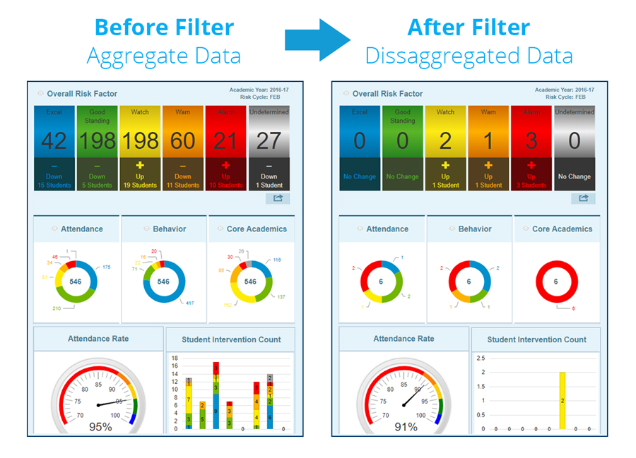
This helps streamline the process of finding underserved students.
Bonus Tip #2: Take Advantage of Learning Circle’s Custom Filters & Custom Watch Lists
Educators can use Learning Circle to create custom watch lists to easily keep tabs on the trends of underserved students at any level: district, school, classroom, or even students involved in specific community organizations.
Learning Circle also makes it easy to compare student populations by gender, race, 504 and IEP plans, grade level, Limited English Proficiency (LEP), whether a student is new to the district, and more!

Do you have any tips on how to find and serve underserved students? We’d love to hear them in the comments below!